After all those years teaching typography at different art schools, my dream is to start my own that only focusses on typography. But not as we know it…
Why?
In The Netherlands, art academies were asked (around 2010) to develop a clear profile for their institute. It means that they had to look for new definitions for the various art disciplines. I think that was a good thing; I embrace change. Graphic Design moved forward, but typography felt short.
Typography offers a pre-eminent distinction between Graphic Design and any other (art)discipline. But it doesn’t feel this fresh breeze. Indeed, it is left out of the nuts and bolts of these new curricula. Why? ‘Typography is something that is used in old books. And books are dead. So typography is also dead.’
How would my school look like?
I believe typography works on two levels. The first one is the technical know-how of working with the ingredients on a macro- and microlevel. This is the visual representation of text. Most people think typography ends here.
But there is another level that is just as intriguing and powerful: Letters make words. Words have meaning. Meaning comes from language, and language will never disappear.
Although we might not be reading as many books in the traditional sense, we now consume more words than ever before when face down in our digital devices.
I was happy to read I am not the only one who thinks like this.
I quote from the book Type & Typography, written by Phil Baines (Professor of Typography at Central Saint Martins College of Art & Design):
Debates within typographic design education have traditionally focused on the appearance of typography in relation to the message.
They have tended to examine aesthetic and technical considerations such as font selection, hierarchies, spatial arrangement, grids, and style.
While such discussions are pertinent to all that we do as designers, they perhaps overlook the obvious: that typography is intrinsically visual language.
It is a strange anomaly within the education system that a subject —language— and the notational system devised for its recording —typography— are taught in unrelated institutions.
Typography is to language what maps are to geography, scores are to music and algebra to mathematics.
So it would be a school that deals with this broad definition of typography. I worked everything out.
The [New] Typography School is a one-year master course about exploring typography in new contexts, based on a solid body of knowledge, an open mind, and innovative thinking.
The study year is divided in 3-weeks projects, each focusing on a specific subject.
In the morning we focus on theory and practice to develop necessary knowledge and skills. We will also read and discuss theories of various typographers to understand different perspectives.
In the afternoon we focus on various contexts like culture, language, and philosophy in relation to typography. For these classes, guest teachers are invited that make you question your assumptions.
Let me show you an example of a typical day at The [New] Typography school.
>Thursday 21 April 2021
We start at 10.00.
(I support the idea that working before this time is not productive)
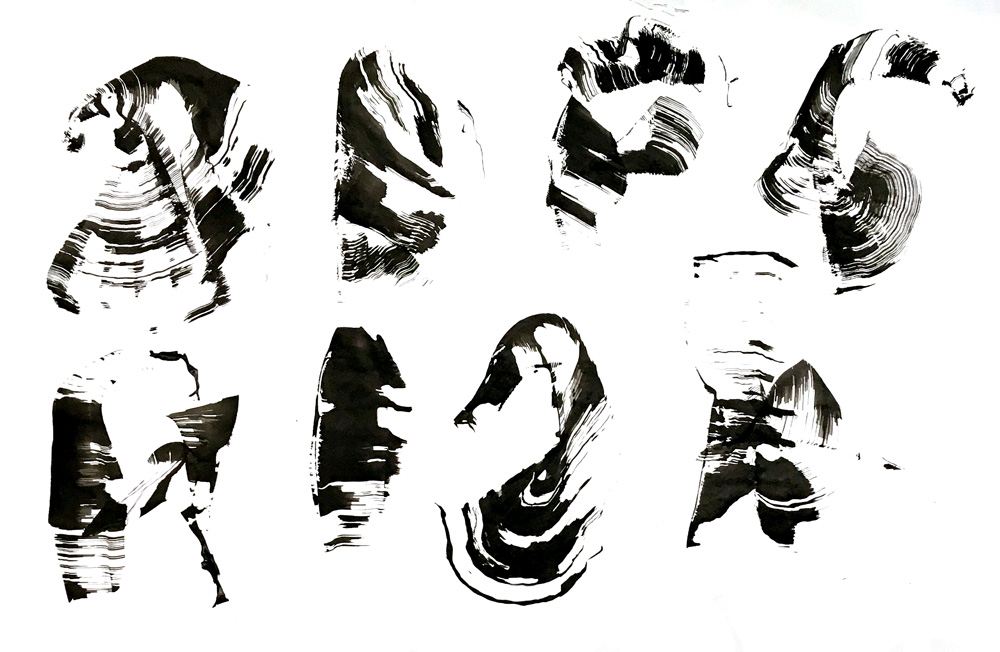
This project we are working on calligraphy. Not to learn how to write beautifully, but to understand letter shapes. We write in different scripts, relating to their history and specific character. The practice is theory-based.
We end morning class at 12.30. We have a break to have a good lunch like people in Italy, taking their time.
At 14.00 class of NeinQuarterly starts. Often he is described as being a philosopher, but he rather calls himself a ‘failed intellectual’ that embraces nihilism.
He reminds me of Woody Allen. He has almost 100.000 followers. He wrote: ‘ What did Jesus have, like 12 followers?’
Twitter is his medium. He doesn’t have a desk, he just carries his phone. ‘The best tweet is always one step ahead of you, it’s somewhere out there.’
The hardest part is the context. He can’t control it. One of his light-hearted tweets could easily end up between tweets about a serious natural disaster. Expressing the right tone of voice is essential, but almost impossible. ‘Less is more. More or less.’
I think he is a poet, as he writes himself:
‘One who breaks lines
to complete
a thought.’
How does this relate to typography? Well, that is for you to ask and for me to know.
So drop me a line and let me know if you would apply. Then I will do my best to open the doors.
Typography is dead, long live typography!