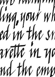
Gerardus ‘The Rebel’ Mercator
I learned writing italic through the manual of Mercator, which, still today, serves as a good base to teach my students.
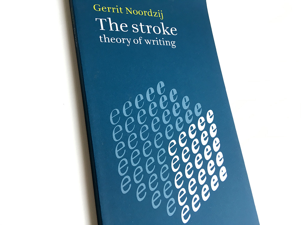
Gerrit Noordzij is a living legend in the type design world, especially at the academy in The Hague. His theories are the base of type design knowledge there.
Before I went to the academy, I met him a couple of times. First of all by reading his book, The Stroke. I was 14 years old, too young to understand the content. I kept rereading because I really wanted to understand. The pictures looked so simple and straight forward.
Then, after reading it about 4 times, it suddenly hit me. At that time I had some experience in writing calligraphy, so I knew how to focus on the shape of letters. Seeing your pen glide over the paper making the strokes. A two-dimensional world shifted to a three-dimensional world. The strokes suddenly came to life.
When I wanted to do the admission to the academy, my father took me to meet him. They are friends. Gerrit was living at a small farm.
I remember looking at the ground of what once was a stable. It was an old concrete floor, and it had some beautiful letter carving. He smiled and said: ‘Sorry, couldn’t help myself’.
He asked what I wanted to learn at art academy, and I said: ‘Everything about letters’. ‘Well,’ he answered, ‘then there is just one place to go. That is the Royal Academy of Arts in The Hague.’
His answer was clear. The discussion he had with my father was not. Within two minutes, their conversation was about the bible on a deep intellectual level. My attention was with his answer.
Gerrit Noordzij was teaching ‘calligraphic exercises’ at the Royal Academy, which founded the theory for this book. It became my bible.
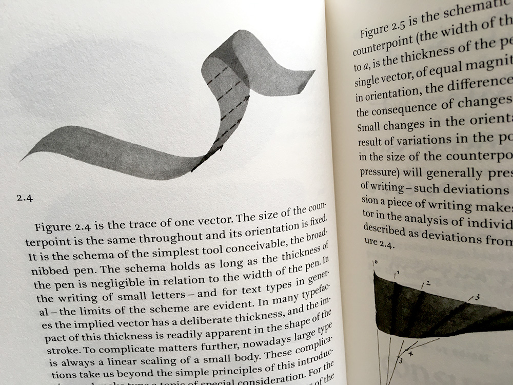
The Stroke puts forward a genuine theory of all writing, with any kind of implement. Noordzij starts from basic principles and gives his attention first to the space around the letters: the white space that serves to define and distinguish what any letter is.
I remember one of his assignments was to make a good stain on the paper. He said a letter is not any different from a stain. It is black and white, making a shape and a counter shape.
He describes in minute detail how the strokes of writing can be formed. Here he uses simple geometrical concepts to underpin his descriptions. So the book is far from a work about art calligraphy and beautiful forms. Rather it is a sustained description of the phenomenon of letters.
Noordzij’s theory serves to repair the split that grew up, with the invention of printing, between written and typographic letters. He shows us the underlying ‘written’ quality of all letters, with whatever technology they have been formed. With these ideas, Noordzij can be seen as a prophet of digital typography, in which typefaces have been freed from the constraints of their embodiment in metal.
The stroke has practical consequences that transcend any simple ‘how to do it’ approach.
It is translated in I don‘t know how many languages. I suggest you read it in your own language. It is complicated enough. Besides that, it is so interesting and valuable that you don’t want to misunderstand anything.
Share this post

I learned writing italic through the manual of Mercator, which, still today, serves as a good base to teach my students.
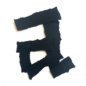
White means silence, just like silence in music.
Without silence there is no music.
This question is closely related to: ‘How do I choose a typeface?’
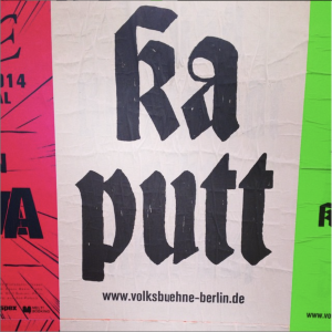
The most common answer:
based on conventions and connotations.
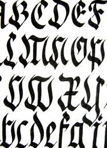
Honestly, I always feel a bit embarrassed to call myself a calligrapher because of its frumpy identity.