I want it white on black!
White means silence, just like silence in music.
Without silence there is no music.

—The common answer—
To find your way in so many options it can be a big help to read something about type classification. Type classification is a system used to divide typefaces into categories.
What I find really important is that you don’t use the type classification for choosing a typeface based on conventions, like ‘use a serif font for a text that should have high legibility’ or ‘use a sans-serif typeface if your text should look modern’. Research shows that that is quite debatable.
Instead, the type classification is useful for several reasons: to help identify typefaces historically and to distinguish them visually. This is an objective way in itself, but conventions are made by it as well.
For instance the typeface Bodoni, which was designed by Giambattista Bodoni (1740–1813). In that time, typography was in its prime time. A book was considered to be a status symbol. Printing techniques developed more and more, as were the techniques to make paper, which made it possible to make more refined type. So that is what he did.
He embraced luxury. The paper, the typeface, but most of all: the white. Margins that were bigger than the text area. His books screamed: ‘LOOK HOW EXPENSIVE I AM!’
The typeface Bodoni is considered to be the most aesthetic typeface ever. And still today, it is used especially in luxurious settings like fashion magazines. If I would ask you ‘describe this typeface’, I‘m sure you would say: it looks elegant and luxurious.
I‘m also sure you don‘t know about Bodoni himself and the status of typography at that time. But does that matter? You DO know about the feel of the typeface. However, I think it is valuable if you know where that feel comes from, so you can question its convention.
Another victim of convention
Let me tell you something about Fraktur. Huh, what is that? Ok.
Let me tell you something about German letters, those we know from the war. Now you know, right? Would you use it for the visual identity for the New Jewish Museum? Probably not.
In English, Fraktur goes by a different name: blackletter. Note: Fraktur is a notable script of this type, and sometimes the entire group of blackletter faces is incorrectly referred to as Fraktur.
Once upon a time in that bygone era of knights and castles and feather quills, blackletter was used all across Europe. There is a whole story to it, but let me put that aside for the moment.
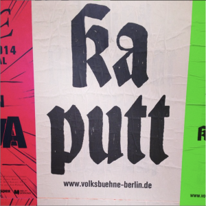
I want to focus on the fact that this typeface has so many negative connotations to it that you can hardly use it anymore. Still, designers try, with all the consequences. There is an interesting story about that on the website Fonts In Use, which tells us about an intriguing visual identity for the Volksbühne in Berlin. Please note that the links in the article are all worth reading and give you a good in-depth view.
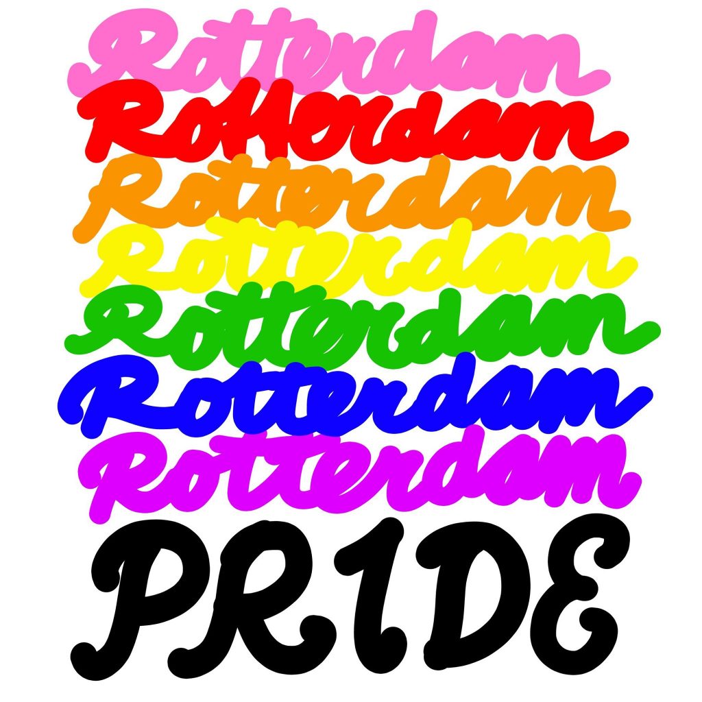
Another example that is a bit closer to home is the campaign for Rotterdam Pride, done by 75B. They changed the typeface from fraktur to a script typeface, and I was curious why. I asked them.
Their answer was:
The first year that we did the design for Rotterdam Pride (2016) was just after the Orlando shooting. We thought celebrating diversity was not appropriate. The campaign had to be a protest, so we created a handwritten campaign for that.
Last year we wanted to continue that line, with a hard / protest letter. We ended up with a fraktur, because of the tension between the connotation of it and the message of Rotterdam Pride. A huge (and beautiful) contrast.
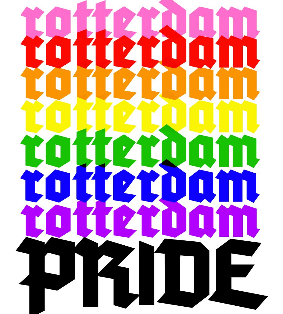
The campaign was presented on a Friday and reactions were not mild. On Fridays 75B is closed and the marketing person from Rotterdam Pride would go on holiday the next day. The reactions of the grassroots were so intense that we were quite surprised. Rotterdam Pride then asked us to quickly create a new image. As a joke we suggested making a comic sans version, but a friendly – not-hurting anyone – script letter came out.
Connotations and conventions are persistent. However, they are not only negative; they help to understand and analyze our visual environment. It is part of being a human being.
Nevertheless, part of being a designer means you have to be aware of them and consciously use them.
White means silence, just like silence in music.
Without silence there is no music.
This question is closely related to: ‘How do I choose a typeface?’
The most common answer:
based on conventions and connotations.
Type designers are most of the day zoomed in 2000% into their screens. Does that something to their minds?