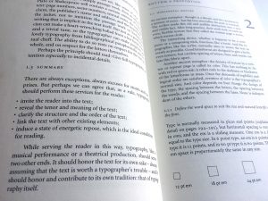
You should do this, you shouldn’t do that. This is why you probably think typography is difficult and boring.
Let me present you a closer look at typography, type and penmanship.
Three fields that overlap, yet are totally different worlds…

You should do this, you shouldn’t do that. This is why you probably think typography is difficult and boring.
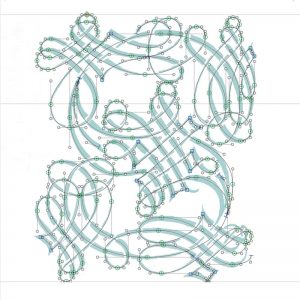
Type designers are most of the day zoomed in 2000% into their screens. Does that something to their minds?
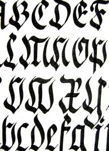
Honestly, I always feel a bit embarrassed to call myself a calligrapher because of its frumpy identity.
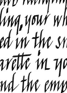
I learned writing italic through the manual of Mercator, which, still today, serves as a good base to teach my students.

As a typographer, you can organise text in a visual way so it doesn’t take too much time for the reader to find her way.
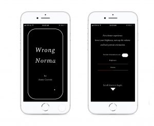
She is all over the place, nervously giggling, apologizing for her mood, jumping from one word to another.
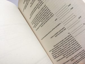
Typography has everything to do with the meaning of language.
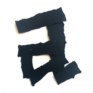
White means silence, just like silence in music.
Without silence there is no music.

The rules by itself are not difficult. The difficult part is to find your way to use them (or not).
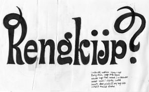
This question is closely related to: ‘How do I choose a typeface?’
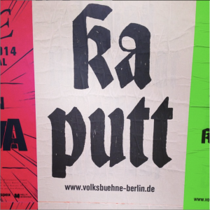
The most common answer:
based on conventions and connotations.
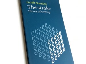
A letter is not any different from a stain. It is making a shape and a counter shape.
If you think that typography is all about technique and skills, you miss out on its true potential.

Teaching typography is complicated, because talking about typography easily becomes a conversation about taste.
If you have a short question, just send me an email. I will answer you fast.
If the answer becomes more complex, I will publish it here, so others can learn from it as well.
NO STRINGS ATTACHED!