
Hierarchy
As a typographer, you can organise text in a visual way so it doesn’t take too much time for the reader to find her way.
When I was 18, I started reading books about the rules of typography. Those books are the classics, and the way these traditional and strict typographers talk to the reader, made me smile. They learned me a lot.
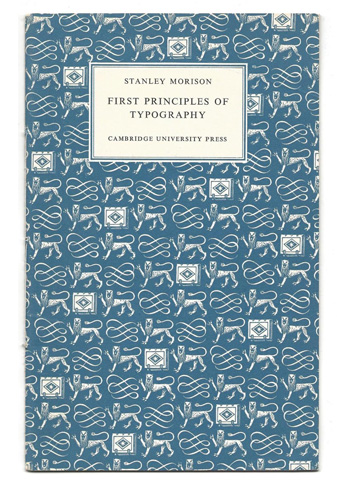
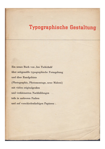
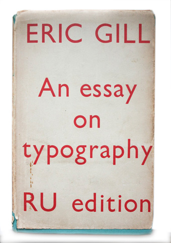
Eric Gill, Stanley Morrison, and Jan Tschichold are all great typographers. Their books say the same but in their own way.
If you are really interested they are well worth reading, but I do understand that their strict and smug attitude might scare you off.
Usually, in class I try to take away this feeling as soon as possible. Honestly, who says that typography SHOULD be like that? In the end, is it not the eye that should be trained and be able to judge if something is good or not?
This is why I know about the rules, but I am also quite biased about them. However, there are a few that are absolute.
For instance, Jan Tschichold is very strict in the fact that LOWERCASE SHOULD NOT BE SPACED. If you give them too much space, they lose their connection to the image of the word. It’s like you see them as individual, separate letters.
Once I saw a truck on the road with the transporter’s name. It was a short name, something like ‘Dirks’. And it was a long truck, almost 20 meters long.
The ‘designer’ decided to use the whole length for the short name. It looked ridiculous.
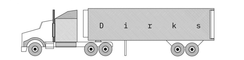
Capitals, however, can deal with more white around them. So if you would like to design a truck, please use the caps.
People who say: ‘Oh, but rules are made to be broken’, have to keep in mind which rules to choose.
Anyway, there is one ‘book’ that is actually a book online, that I strongly recommend if you want to know how to deal with typography. It is called Practical Typography by Matthew Butterick, who is a writer, typographer, programmer, and lawyer.
I think he is very thorough and makes the right remarks. Please also read the chapter ‘Why typography matters’. Really interesting and well-written content! It is everything you need to know.
If you would like more pictures, I recommend ‘Shaping text’ by Jan Middendorp. Same for this book: good and complete references. What I find really smart is how he —as a writer— stays in the background without being invisible.
I would like to leave you with one final thought. What I often hear is that people are not interested in knowing about the rules. This can mean two things.
I’m totally fine if you want to disobey the rules, but at least know what you disobey, so you can REALLY disobey.
The rules by itself are not difficult. The difficult part is to find your way to use them (or not). I think they can be a good starting point to practice because practicing is essential. Just do whatever they say. Then LOOK at it. Does it work? Because in the end, that is also what they did.
Good luck, and if you have any questions: you know who to ask!
As a typographer, you can organise text in a visual way so it doesn’t take too much time for the reader to find her way.
She is all over the place, nervously giggling, apologizing for her mood, jumping from one word to another.
Typography has everything to do with the meaning of language.
White means silence, just like silence in music.
Without silence there is no music.
You should do this, you shouldn’t do that. This is why you probably think typography is difficult and boring.