Hierarchy
As a typographer, you can organise text in a visual way so it doesn’t take too much time for the reader to find her way.
I have had many discussions with typographers about the fact of whether typography connects to language or not. Some say typography is the visual representation of text, but that it has nothing to do with the meaning of language.
I state the opposite: typography has little to do with the visual representation of text but has everything to do with the meaning of language.
Let me explain this with one of my assignments in typography class.
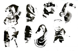
Design the word ‘agelast’. A girl asks what it means. ‘I’m not telling you,’ I answer. ‘And you’re not allowed to look it up.’ What happens? Since she doesn’t know what it means, she doesn’t know what to do.
However, it’s BECAUSE she doesn’t know, she feels freedom. She can focus on the shapes of the letters, approaching them as image. The result is quite experimental, she is not bothered by legibility or any other conventions that were set by conditioning.
When this assignment is done, I hand out part 2. ‘You know what agelast means? It means ‘a person who never laughs’. Now do it again.
This time the students are scared to touch the order of the letters, to touch the word. They start thinking because it makes a connection to meaning, and that has an important consequence: they have to deal with the context.
Text and Context
Typography deals with word-image and word-meaning. The parameter they share is context.
Text literally means ‘woven’. Context means ‘interwoven’.
I’m not saying that I am here to solve the complexity of context, or even discuss it. I only want to note that students should be aware of it, on a visual and content-wise level, when it comes to typography.
The context of word-meaning in typography
In linguistics, meaning is the information or concepts that a sender intends to convey or does convey, in communication with a receiver.
Here ambiguity comes in. Ambiguity means confusion about what is conveyed, since the current context may lead to different interpretations of meaning. Many words in many languages have multiple definitions. Ambiguity is an effect of a rupture of the rule of identity in the context of the exchange of information. Particularly the sender may be physically absent, and the contexts explicitly divergent, such as will be the case when the receptor is a reader and the sender was a writer.
Ambiguity deals with:
1. Pragmatics (the study of how context affects meaning)
2. Semantic meaning (the relationship between words and their referents, dealing with denotations and connotations)
3. Conceptual meaning (languages allow information to be conveyed even when the specific words used are not known by the reader or listener. People connect words with meaning and use words to refer to concepts. A person’s intentions affect what is meant.
This sounds all complicated, and not relevant to visual people, but really, as designers, we are dealing with this every day.
The context of word-image in typography
Why things look like the way they look, are based on the same things as described above, but then on a visual level. The world of designers is full of pragmatics, connotations, and conceptual meaning.

Being aware of this, but also being disappointed by this, I made the website www.stereotypo.nl. It is a collection of stereotypes in typography, which is the result of an assignment I gave to students from the KABK and the WdKA. The assignment was to explore and analyze one stereotype in typography, write a manual ‘how to fit in’ and design a solution ‘how to stand out’.
The assignment made the students aware of the fact of how the world around them is visually organized, and how they can manipulate or try to change this.
Word image and word meaning are interwoven. I strongly believe in this and it would be great if I could find some like-minded colleagues to implement this in the education of typography. And no, this is not on a master-level, as it is not so much a deepening as it is an attitude.
An attitude that will make us approach questions like ‘how to choose a typeface’, in a new contextual way. Typography becomes to language as what the instrument is to music.

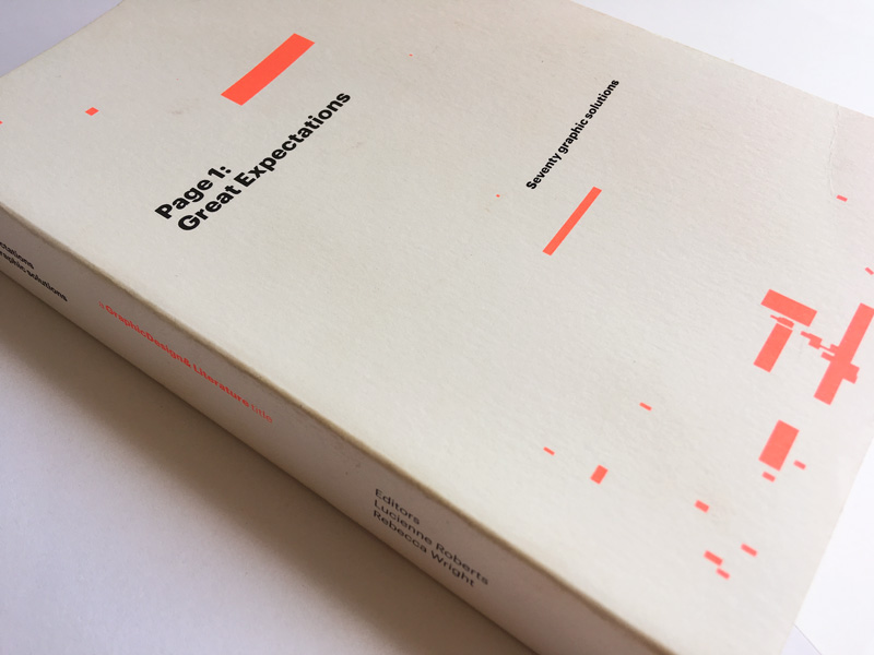
Next week I will write about this book; it shows exactly about this attitude I am talking about.
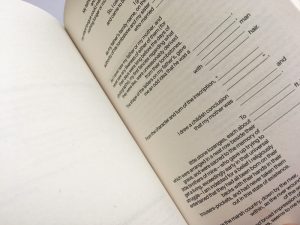
Page 1: Great Expectations is an unusual typographic experiment designed to explore the relationship between graphic design, typography and the reading of a printed page.
In this way, typography is not restricted to paper or screen, or by visual conditioning and limited purposes. Typography becomes a medium in itself. I think we might need a new name.
As a typographer, you can organise text in a visual way so it doesn’t take too much time for the reader to find her way.
She is all over the place, nervously giggling, apologizing for her mood, jumping from one word to another.
Typography has everything to do with the meaning of language.
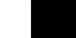
White means silence, just like silence in music.
Without silence there is no music.
The rules by itself are not difficult. The difficult part is to find your way to use them (or not).