Hierarchy
As a typographer, you can organise text in a visual way so it doesn’t take too much time for the reader to find her way.
“I wish I started the assignment earlier this week… Now I’m so into it, but that only happened last night!”
She is all over the place, nervously giggling, apologizing for her mood, jumping from one word to another. At the same time she shows modesty, insecurity, or is it just enthusiasm?
Whatever it is, she should only be proud of her work. She did something none of the others did, and by doing this, she showed me that my ideas for a new place for typography in art education actually can become real.
Skip the ebook
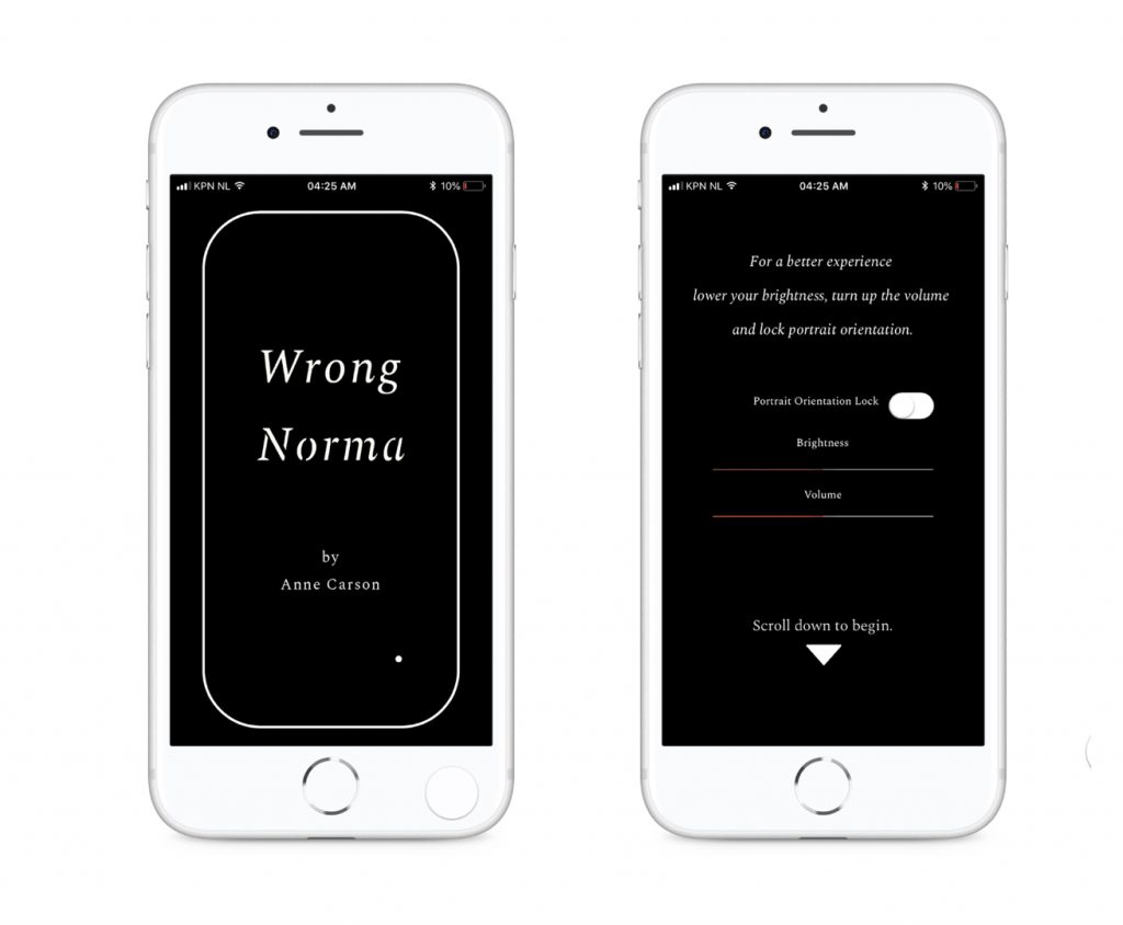
The assignment I set up with my colleague Arjen Suijker for last weeks elective at the Willem De Kooning Academy was based on a project called ‘Ambient Literature’: a two-year collaboration between UWE Bristol, Bath Spa University and the University of Birmingham, established to investigate the locational and technological future of the book.
In the development of digital publishing they skipped the ebook, which is a clear example of skeuomorphism, an obstinate part in the progress of human development.
The ebook mimics the physical BOOK: pages that are made to look old, that need to be turned, that have numbering, a bookmark that you can place, typography is submissive to the taste of the reader, and the story is linear.
What appeals to me the most, is that the project involves writers: stories don’t need to be written linearly anymore. The story leaves the static page. The digital device (this project focuses on the use of the phone) offers options like sound, movement and context.
This also means a new role for typography: it becomes an active member of the story, not just a messenger.
I handed the students two things.
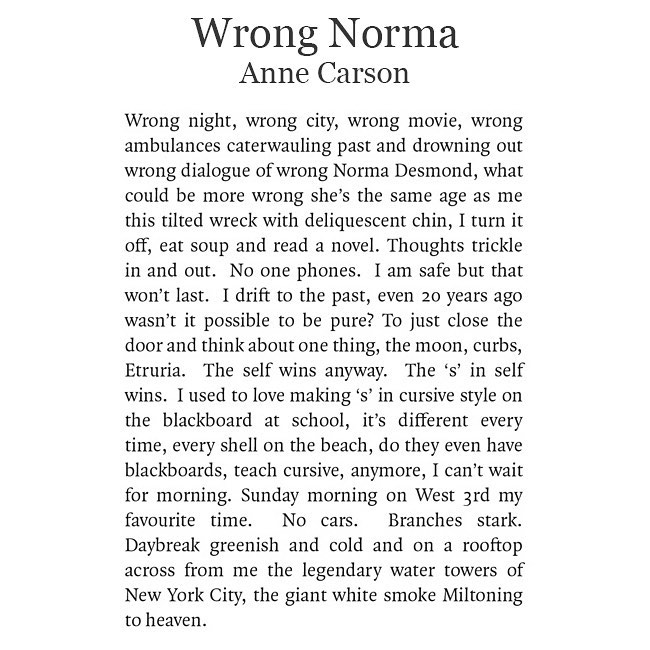
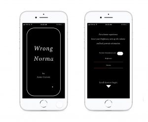
First of all the text, a poem by Anne Carson. I gave it to them as a picture, since I wanted them to type it over, making sure that they read every word.
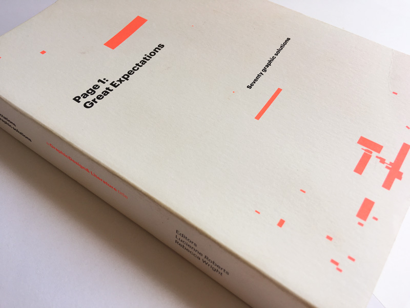
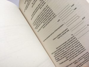
Secondly, I handed them some pages from the book ‘Page 1: Great Expectations’ by Charles Dickens, published by GraphicDesign& and curated by Lucienne Roberts and Rebecca Wright.
The book set out a briefing to 70 designers across the world: design the first page of the novel Great Expectations by Charles Dickens. The response was huge, and when the editors looked at the layouts, they started to identify groupings based on the recurring themes that they found most interesting. They decided to organize the design within six overarching categories, resulting in the themes: Book, Word, Interaction, Image, Tone, and Story.
My goal in teaching is to let everyone discover their own way of dealing with typography, so this book was a hit.
What I found most remarkable to read is that certain approaches show new insights that are very valuable and learn full for students AND teachers.
For instance, the designers of the theme Book put a lot of effort into choosing a font and describing why. Designers that choose the theme Words are more focused on the meaning of the text and show less interest in the typeface choice.
I asked the students to choose a theme from which they would approach the text and the typography. (I aimed to show them that these different approaches actually exist. By making a choice they got more aware of their own attitude.)
Most of them choose Tone or Image, which I expected, just one of them choose Book(which I also expected).
However, more than I expected choose Word, a theme that approaches the text from a linguistic perspective.
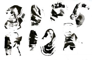
The energetic student Sevgi: “I really wanted to know who ‘Wrong Norma’ was. I found out certain things, which lead me to new facts, and then the poem suddenly made sense to me!” (Others described the poem as ‘a train of incomprehensible thoughts.’)
You see what you know. She knew more than the other students, so she saw more. She realised who ‘Wrong Norma’ was, decided to watch the movie ‘Sunset Boulevard’, and learned about cursive construction. That knowledge gave her direction to make design decisions that made all the difference.
As a typographer, you can organise text in a visual way so it doesn’t take too much time for the reader to find her way.
She is all over the place, nervously giggling, apologizing for her mood, jumping from one word to another.
Typography has everything to do with the meaning of language.
White means silence, just like silence in music.
Without silence there is no music.
The rules by itself are not difficult. The difficult part is to find your way to use them (or not).