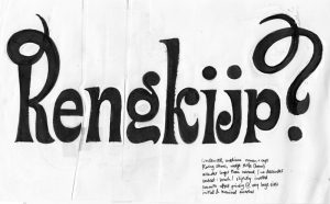
—My personal answer—
In my 12 years of teaching, this is one of the most frequently asked questions. Unfortunately, this question can’t be answered simply; the process is a bit more complicated.
The question ‘how’ is not so interesting, let’s focus on ‘why’.
Aesthetics should not be a reason for itself. Behind most typefaces, there is a concept, a reason why it is designed.
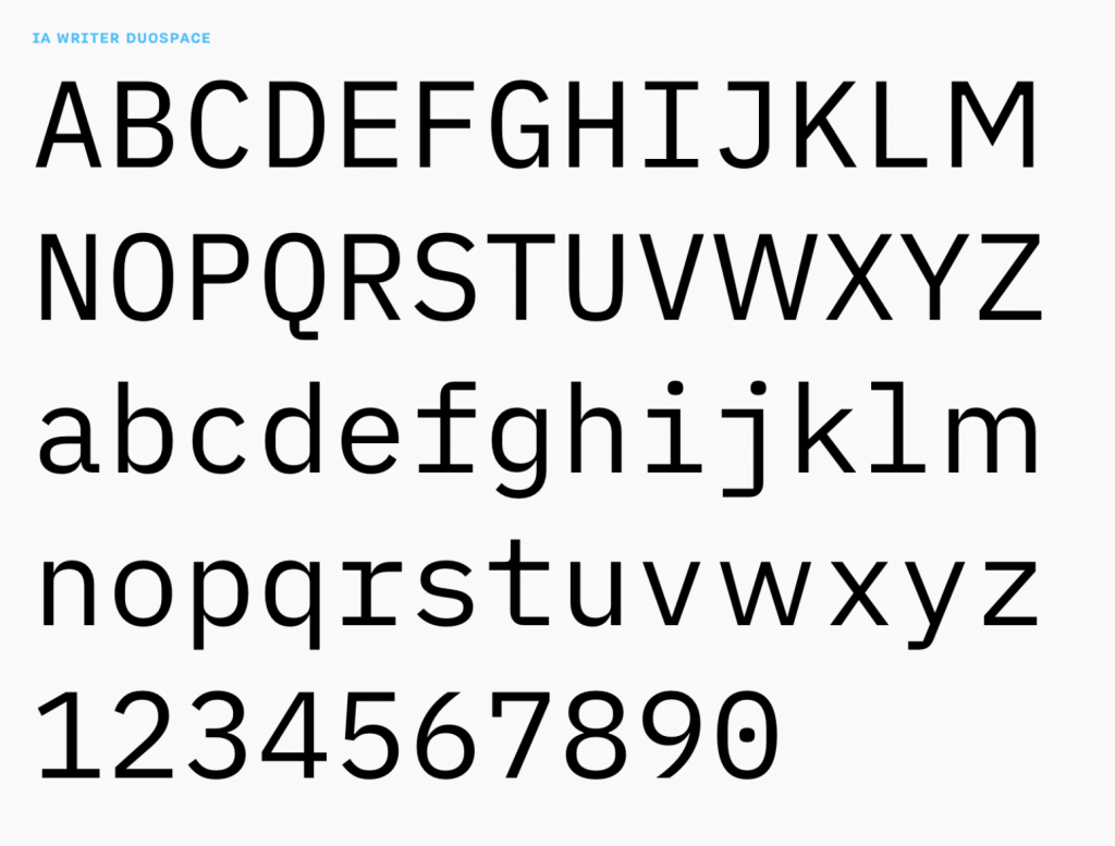
Let me tell you about the typeface of this website, which is IAWriter Duospace.
*Uuuuhhh… update May 2020: I changed the typeface..! Will explain at the end why, and to which one.
This was a conscious choice, not so much because I think it is ‘beautiful’ (there are many ugly and beautiful typefaces), but it has a concept behind it that I totally support on different levels.
Conceptual level
The typeface was ‘designed’ by Oliver Reichenstein, founder of Information Architects. Reichenstein is not a graphic designer or type designer. He studied philosophy, which is why he asks questions.
Questions that are criticized by designers that find them irrelevant or too far fetched. I love his questions and although the solutions may be a bit far fetched, the questions itself are definitely relevant.
Questions like:
Why would you use a monospaced typeface?
How can you close the gap between the writer and the reader by adjusting certain characteristics of a monospaced by making them duospaced?
You can read more about his questions on the blog of Information Architects.
Functional level
As Reichenstein puts it: ‘In contrast to proportional fonts that communicate ‘this is almost done’ monospace fonts suggest ‘this text is work in progress.’ It is the more honest typographic choice for a text that is not ready to publish. The typographic rawness of a monospace font tells the writer: ‘This is not about how it looks, but what it says.’ —
This ‘feel’ we have is deeply rooted in a visual society. It is based on connotations that are very persistent in the world of typography.
It is like talking about colors: red is the color of love, blue is the color of trust, etc. I think we should be aware of those connotations. To apply them. Or not.
Contextual level
IAWriterDuospace is a follow up of their typeface Nitti iA, which was a typeface based on Nitti, designed by BoldMonday.
Nitti iA is a proportional version of Nitti. However, the clients couldn’t appreciate the monospace feeling of the typeface, and they also got more doubtful themselves.
‘The true benefit of a monospace font gets gradually lost the closer you move to a proportional font. Eventually, we realized, that while Nitti iA is great to write casual text in, it’s not the end of typographic wisdom for reading or writing fonts. Nitti iA works nicely for email but too fast for a careful writing environment, and not fast enough for publishing. Maybe we really cannot have our cake and eat it?’
So they started from scratch, implementing their new wishes of duo spaced typefaces into Nitti iA. It had the working title Nitti iA 735, because it took them 735 variations.
But then something happened. Bold Monday released IBM Plex, an open-source typeface. Reichenstein fell in love with it immediately. With some adjustments, taken from the whole process of NittiIA 735 and his thoughts on the typography they desire for in their business, IAWriterDuospace was born.
Aesthetic level
I am convinced that this is the last level. At this level, you are talking about ‘ugly’ and ‘beautiful’ which is of course subjective.
My aesthetics define my choices as a typographic designer, which is probably different from yours. And that is totally OK.